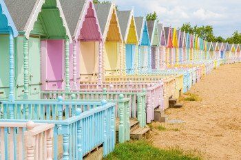
Whether natural or artificial, colour is everywhere. Most
people have a ‘favourite’ colour but may not have considered the wider impact
colours have on our mood and day to day life choices; whether that’s the food
we eat, what we wear or how productive we are at work.
Everyone is individual, and aspects such as culture,
experiences, context and personal preference all influence how colour affects
us. Even so, there are widely held beliefs and research which show that certain
colours produce different emotional and physical responses amongst the majority
of people.
Here we will discuss the psychology of colour; the history
behind it, the science behind why certain colours have the effect they do, how
colour psychology is harnessed for business and marketing purposes, and the
meanings and effects of colours themselves.
The
History
The way the colour spectrum is organised was discovered by
Sir Isaac Newton in the late 1660’s when he used a prism to refract white light
into its composite colours; red, orange, yellow, green, blue, indigo and
violet. However, colour psychology actually dates back thousands of years to
the Ancient Egyptians, who studied the effects of different colours on people's
mood and then used their findings for health and holistic benefits. The
Egyptian word ‘iwn’ meaning colour, also translates as ‘disposition’,
‘character’, ‘complexion’ and ‘nature’, showing that they viewed colour as
intrinsically linked to personality.
Theories of colour and its effect on mood have been adopted
by the Romans, Greeks and masters in Ancient China to name just a few.
One of the earliest essays on colour theory was published in
1810 by German artist and politician Johann Wolfgang von Goethe. The Theory of Colour
outlined the
nature, function and psychology of colours, and although dismissed by many in
the scientific community at the time, remains one of the leading explorations
of the effects colours have on mood and emotion.
The advance of modern psychology developed the theory
further, with Swiss psychiatrist Carl Jung becoming a prominent leader in the
field. He stated that “colours are the mother tongue of the subconscious” and
his findings led him to develop art therapies to help people overcome trauma.
Nowadays, colour psychology is used extensively in business,
advertising and marketing campaigns, something that will be discussed in more
detail further on.
The
Science Behind Colour Psychology
Although we are exploring the impact colour has on our
psychology and emotions, there are scientific processes that help explain why
certain colours have the impact they do.
We are able to see colour due to light falling on the
retina, these wavelengths are then converted into electrical impulses and sent
to the hypothalamus; the part of the brain which controls our hormones and
endocrine system. Colour signals can trigger the hypothalamus and make us feel
happy, sad, angry or even hungry.
There is evidence to suggest that our brains are hardwired
to like or dislike certain colours, due to a mix of evolutionary bias and
personal positive or negative associations we may have with that colour. For
example, from an evolutionary perspective humans tend to favour colours like
blue, green and red which signify clear water, healthy crops or food.
What do
different colours represent/how do they make us feel
There are certain colour associations that you may have
absorbed without thinking and,as mentioned, culturally learned meanings play a part when
it comes to colour associations and the emotional response they may invoke. For
example, red in China denotes luck, but in Western countries may signify ‘stop’
or danger. And, while not strictly a colour, white, rather than black is the
colour of mourning in many Eastern countries.
The most commonly associated traits for each colour are as
follows.
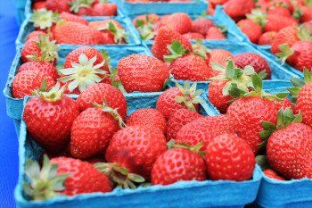
Red
Often used to
represent danger or warning, red is also the colour of passion or bravery. Some
studies have shown that red stimulates appetite which may explain why it
features predominantly in many food and drink brands.
Orange
Warm and
stimulating, orange is considered an energetic colour. It is also attention
grabbing and used for important content like traffic signs.
Yellow
The ‘happy’
colour, yellow is associated with optimism, sun and warmth. Paradoxically
yellow has been shown to irritate the eyes which could explain why it makes
some people feel uneasy.
Green
Associated
with the environment and nature, as well as money and good luck, green has a
similar calming effect to blue hues.
Blue
Said to have
a calming effect, blue is often used in offices as it can increase productivity
and creativity. Some studies have found it can even lower body temperature and
pulse rate.
Indigo
It’s said that Isaac Newton only added indigo to the
colour spectrum because he believed there must be seven colours for ‘occult
reasons’.
Indigo
today is still associated with spirituality and intuition.
Violet
Associated
with wisdom, creativity and magic, violet also denotes royalty and luxury and
is used by many brands who wish to make their products seem exclusive.
How is it
used in business and marketing?
Marketing and
advertising businesses often utilize colour psychology to engage more customers
and ultimately, drive more business.
As discussed, personal preferences, upbringing and culture
all have an effect on an individual’s perception of colour, so it is impossible
to have a ‘one size fits all model’. However, broader patterns can be found in
colour perceptions, and brands use colour to target audiences depending on what
they want to achieve.
The study
Impact of Colour on Marketing
by Satyendra Singh found that up to 90% of snap judgements made when buying
products are based on colour alone, and success depends partly on the traits
associated with each colour, as discussed above, as well as the perceived
appropriateness for each brand.
A study from the University of Missouri-Columbia, found that “the specific colors used in a company’s logo have a
significant impact on how that logo, and the brand as a whole, is viewed by
consumers.”
The study found that blue logos suggested
confidence and reliability, red signified expertise and yellow fun and
playfulness, to name just a few. Additional studies have shown that our brains
prefer easily recognizable brands, so the colours that companies choose for
their product could produce an effect dependent on which other brands use those
colours. For example, many high profile food and drink companies use red in
their slogans and brand identity, so over time we have learnt to associate red
with hunger when used in an advertising context, rather than the traditionally
associated meanings of danger, stop or passion.
Applying
Colour Psychology to Everyday Life
If you want to feel more relaxed at home, more confident at
work or increase energy levels, then the colours you surround yourself with
might have more of an effect than you think. Pale blues, greens and creams are
all popular colours for interiors as they promote relaxation and a light, open
feel. Pale blue and green are also some of the most popular colours for offices
as they can increase creativity, as mentioned above.
Orange is said to be the best colour for a workout for its
energising effects, and it may be a little cliche, but red is consistently
voted the most popular colour for women to wear on a date. Trouble remembering
something important? Research has shown yellow improves memory, which could
explain the iconic colour of post-its.
As it stands, there is still not enough research to uphold
colour psychology as a scientific discipline, but there is plenty of evidence
to suggest that colours do influence our moods and decision making, on both a
conscious and subconscious level. The use of colour psychology in advertising
clearly shows that many respected and well known brands trust the findings
enough to let it influence their marketing, so perhaps in the future we will
see even more research behind this fascinating theory.
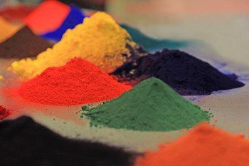
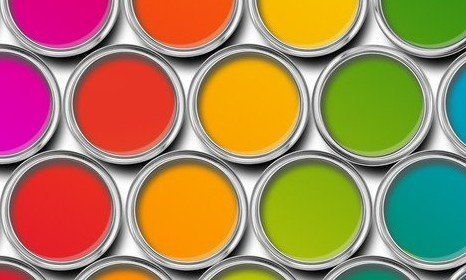
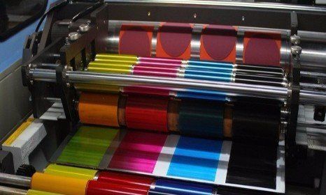
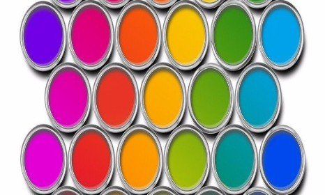
At Centre Colours we are passionate about colour and pigment
in all its forms. As an independent dispersion house that can manufacture
bespoke products in large or small quantities, we are committed to fulfilling
the needs of the ink, paint and coating industries. Visit our
website today
to learn more about our services and find
out how our high quality pigments and inks could benefit your business.